The Benefits of Responsive Web Design E-commerce Store
As the owner of an online store, you know how important it is to give your clients the best possible experience. In the modern digital age, this entails having a website that works well and is available on all platforms, including desktop computers, tablets, and smartphones. One of the best investments you can make is to implement responsive web design for your online store. When a website is responsive, it automatically modifies its design to fit any device’s screen size. No matter how a customer accesses your site, your material and graphics will adjust in size and arrangement to make for the best possible viewing experience. For e-commerce, responsive web design has numerous advantages. Increased traffic, greater conversion rates, enhanced user satisfaction, and a future-proof digital platform for growth. If you want your business to thrive online, responsive web design is the way forward.
Mobile-Friendly E-Commerce: Why Responsive Design Matters
For e-commerce stores today, a responsive web design is essential to provide an optimal experience for all customers across devices. With more people shopping on their mobile phones and tablets, if your site isn’t responsive, you risk losing a large portion of potential sales and revenue.
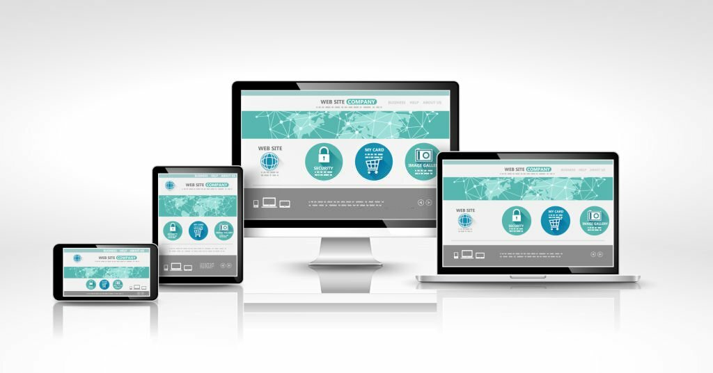
A responsive e-commerce site adapts to the screen size of the device used to access it. Images, text, and buttons are resized to fit everything onto the screen in an easy-to-view and use manner. This provides a consistent user experience and navigation flow regardless of whether someone visits from a desktop computer, smartphone, or tablet.
With a single responsive website, you can avoid the additional cost and effort of building and maintaining separate mobile and desktop sites. Your SEO rankings also benefit since there is just one URL to optimize and promote.

For e-commerce, a responsive design means shoppers can browse products, compare options, and complete purchases easily from any device. Checkout processes are simplified, and payment forms display clearly and scale to fit smaller screens. This convenience and flexibility encourage higher conversion rates and customer satisfaction.
In today’s marketplace, if your e-commerce store isn’t responsive, you risk frustrating customers and losing business to competitors. By implementing a responsive web design, you’ll provide an optimal experience for all your customers, increase traffic, gain higher conversion rates, and boost your return on investment. The benefits of a mobile-friendly, responsive store are invaluable.
Key Advantages of a Responsive E-Commerce Website
A responsive e-commerce website offers key advantages for online businesses.
Increased Conversion Rates
With a responsive design, your store will display properly on all devices, providing an optimal viewing experience for customers on any screen size. This seamless shopping experience across devices has been shown to increase conversion rates. According to studies, the conversion rates of responsive e-commerce sites are up to 60% higher than non-responsive sites.
Improved User Experience
A responsive e-commerce store provides an enhanced user experience since the design and layout adjust to fit the particular device. Customers can easily browse products, read descriptions, and make purchases without pinching or zooming in and out. The improved UX keeps people on your site longer and encourages them to return.
Cost Savings
With a responsive design, you only need to manage one version of your website. This eliminates the additional costs required to build and maintain separate mobile and desktop sites. A single code base is more efficient to update and optimize. The reduced costs and streamlined maintenance help maximize your return on investment.
Higher Rankings
Google favors responsive, mobile-friendly websites in their search rankings. By providing an optimal experience for visitors on any device, your e-commerce store is more likely to rank higher in search results. Higher rankings lead to increased organic traffic and more potential customers finding your business.
In summary, a responsive e-commerce website is essential for providing the best possible experience for your customers and growing your business. With the key advantages of higher conversion rates, an improved UX, cost savings, and higher search rankings, responsive web design should be a top priority for any online store.
Creating a User-Friendly, Cross-Device Compatible Online Store
Creating a responsive e-commerce website design ensures your online store is accessible and provides a good user experience across all devices.
Optimized for Mobile
Over 50% of web traffic now comes from mobile devices. A responsive web design adapts to different screen sizes, ensuring your site is easy to navigate on smartphones and tablets. Customers can browse products, make purchases, and access their accounts whether they are on the go or at home.
Streamlined Checkout
A responsive checkout process is essential for e-commerce. On smaller screens, a simplified checkout with fewer form fields makes it easy to enter payment and shipping information. Options like guest checkout and saved payment methods reduce the number of steps required to complete a purchase.
Enhanced Security
Responsively designed websites typically have enhanced security features like SSL certificates and PCI compliance. These protocols encrypt data and help prevent fraud, giving customers peace of mind when making transactions on any device.
Improved Ranking
Google and other search engines favor mobile-friendly websites. A responsive design optimizes your site for search, which can help improve your ranking in search results and drive more organic traffic. Higher visibility means more potential customers finding your online store.
By creating an e-commerce website that provides an optimal experience across devices, you establish a platform primed for sales growth and long-term success. Responsive web design is essential for any merchant looking to build a user-friendly, cross-device-compatible online store.
Conclusion
As you’ve seen, there are significant benefits to implementing a responsive web design for your e-commerce store. It will optimize the shopping experience for your customers across devices, it will reduce your development and maintenance costs by building a single website instead of separate mobile and desktop versions, and it will improve your search engine optimization by having a single, flexible design. By creating an adaptive, mobile-first website, you’ll be providing the best possible user experience for all your shoppers, no matter how they access your store. The investment in responsive web design is well worth the rewards of increased customer satisfaction, lower costs, and improved visibility. Make the move to responsive design and set your E-commerce business up for success now and into the future.